2024-02-24
Ali Abdaal
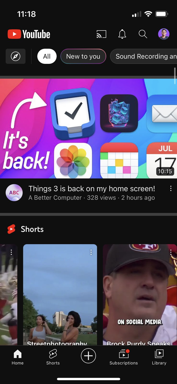
 Simple effective execution. This is a photo of him (that he likes) with the blurred background in the same environment. And then he puts whatever he’s trying to showcase, usually some digital app, in between. Then uses white text with a drop shadow and an arrow to draw attention to some aspect of the thing on screen. This is reusable and you can do this without actually shooting a new thumbnail each time.
2024-01-17
Ramit Sethi
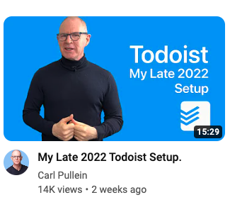
 Simple, reusable format that makes it clear that it’s from him and that it’s a talk / Q&A Format.
2023-05-08
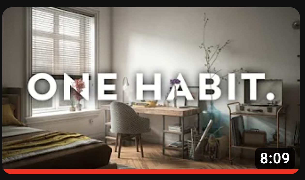
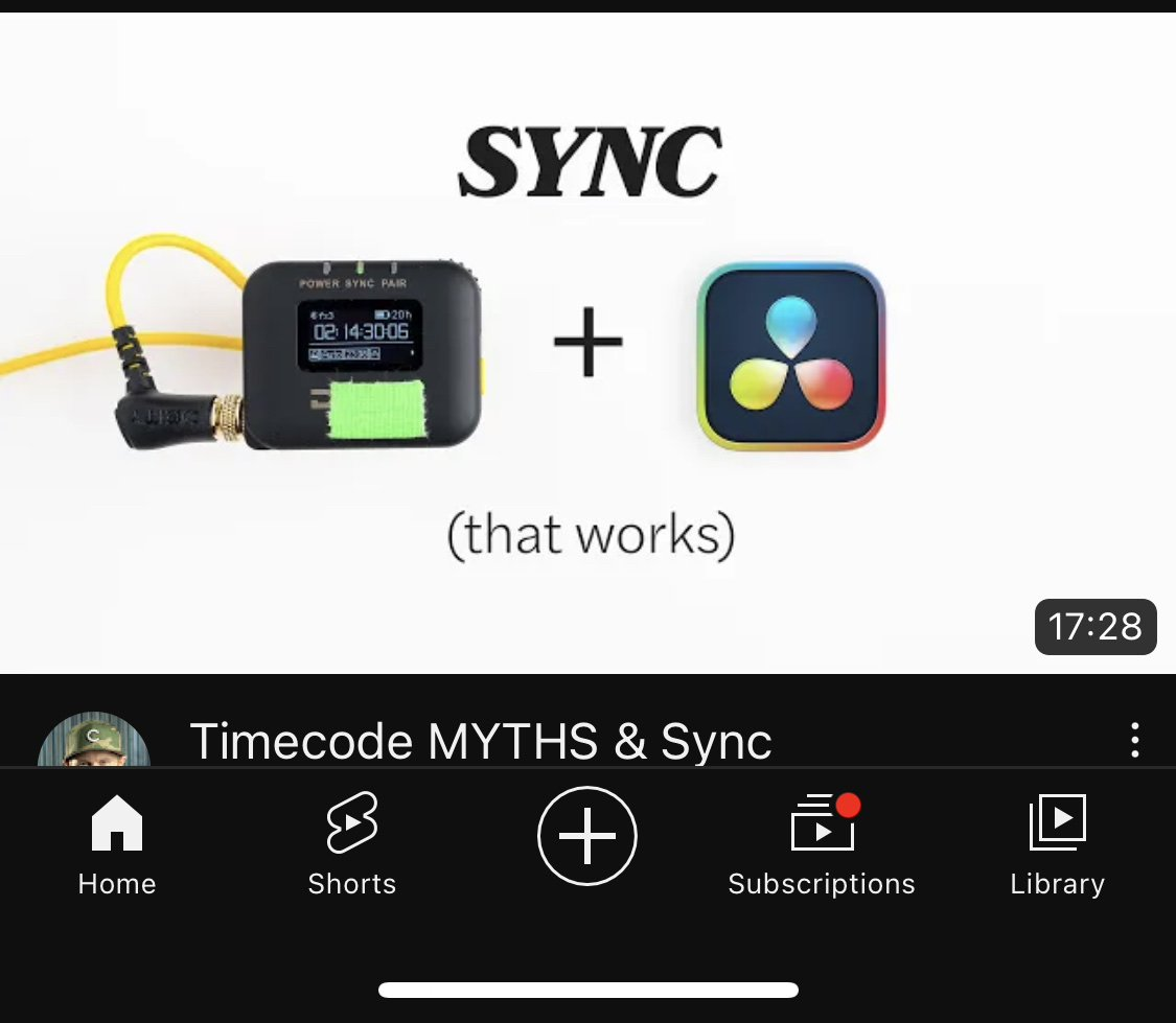 I really like the simplicity of this thumbnail with the off-black text, off-white background and a few simple elements on screen. The cable running off the side is also a nice touch. I’ve been shown this thumbnail a few times, and I remember it each time I’ve seen it. I unfortunately have no need to watch the video (based on the title), but the screenshot pulls me in.
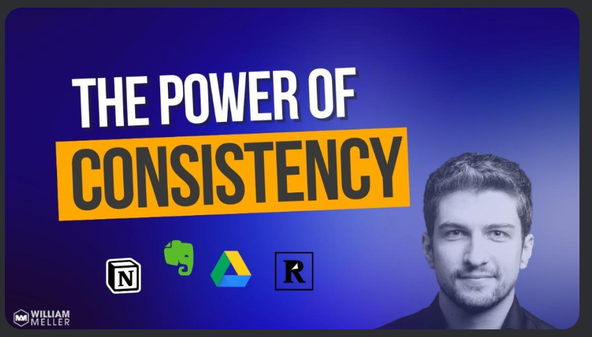
- I like the faux desktop background and icons and that he tilted a specific icon to garner more attention
 7M Subs
Just used the high quality are from the game. Probably wouldn’t work for me
 2K Subs
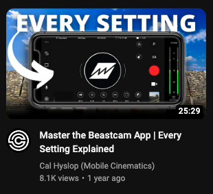
Logo is front and center
Colorful
Arrow lead your eye
 3.5M Subs
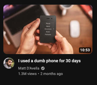
Clean
Beautiful color grade
Device is front and center
Device is unique and recognizable
Background blur is beautiful
Targeting a knowledge worker based on the desk setup
 711K Subs
Cool use of color and typography
 3.5M Subs
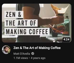
Great color grade
Beautiful Text
 313K Subs
Big Text
Great contrast between the text and the white background
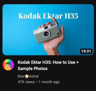 4.4K Subs
Beautiful Color
Simple Shot
Clear Text
Nice subtle gradientv
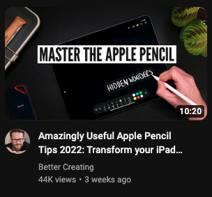 58K Subs
Great text style again
Creating a scene with other items around
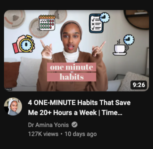 193K Subs
Host first
Icons are useful.
Overall only okay
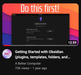 13K Subs
I like that this one has bright colors and lets you showcase an app window easily
 1M Subs
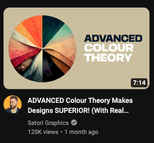
I really like the color work here

