When Life Gives You Lemons, Write Better Error Messages

Metadata
- Author: Jenni Nadler
- Full Title: When Life Gives You Lemons, Write Better Error Messages
- URL: https://wix-ux.com/when-life-gives-you-lemons-write-better-error-messages-46c5223e1a2f
Highlights
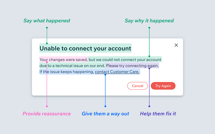
What makes a good error message
 (View Highlight)
UX / Error Messages
We were being a bad friend. At Wix, we have the mantra, “Write it like you’re talking to a friend.” We really believe in empathizing with the user, and being a friend with them throughout their process. (View Highlight)
